info
/
1
2
3
4
5
·
·
·
·
·
Welcome to our new contest, Julie. I am glad to be your reviewer today.
The flora and especially flowers are among those iconic themes every artist has portrayed at least once in their lifetime. The relationship of flowers with the arts is so old that is lost in the mist of time. Every now and then some great floral works stand out, showing off that the subject has never lost its significance for the creative mind.
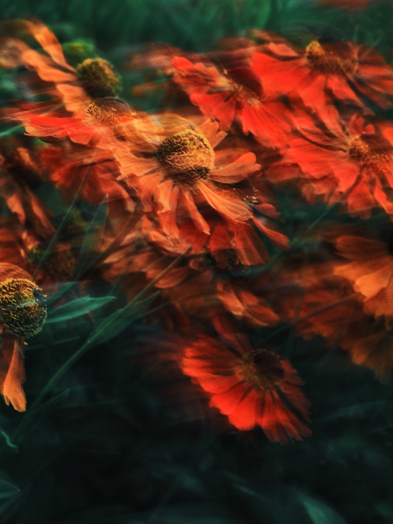
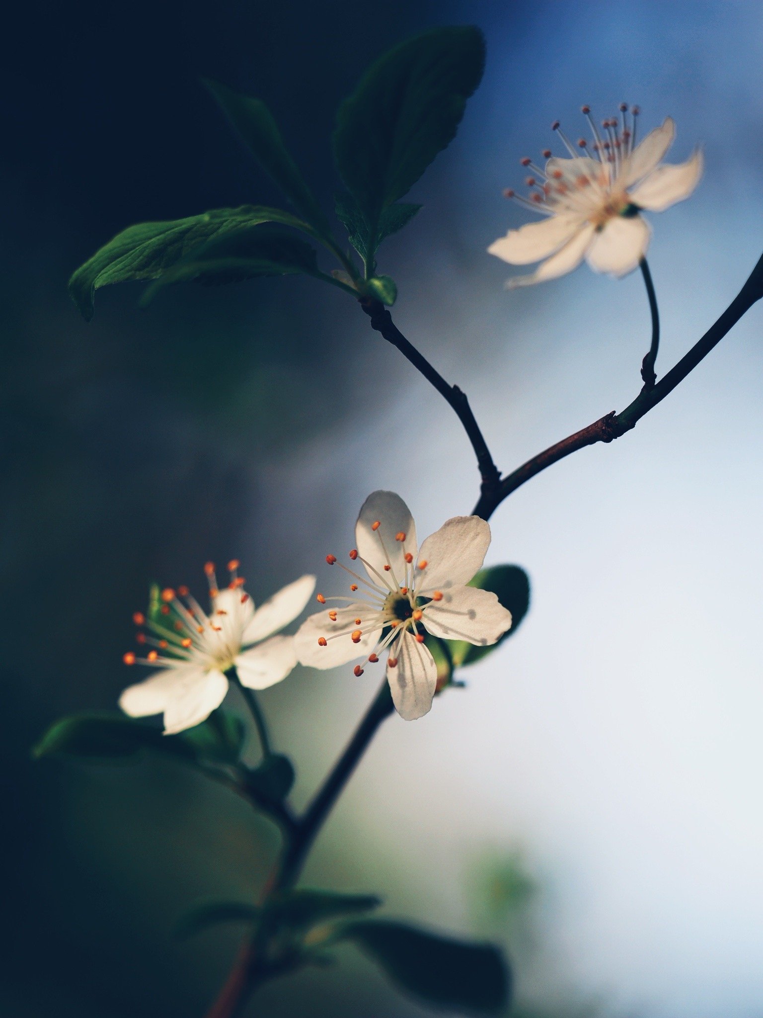
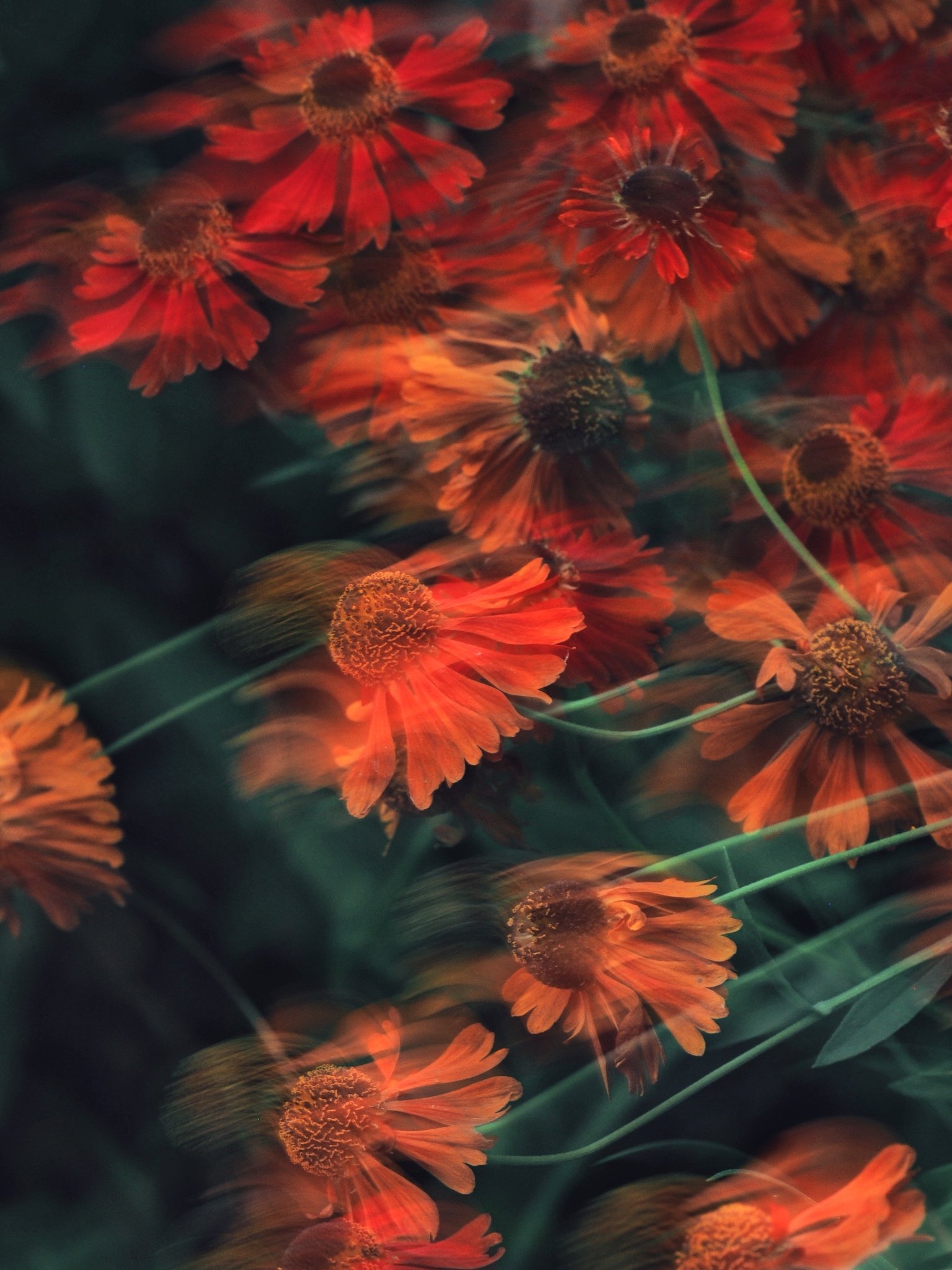
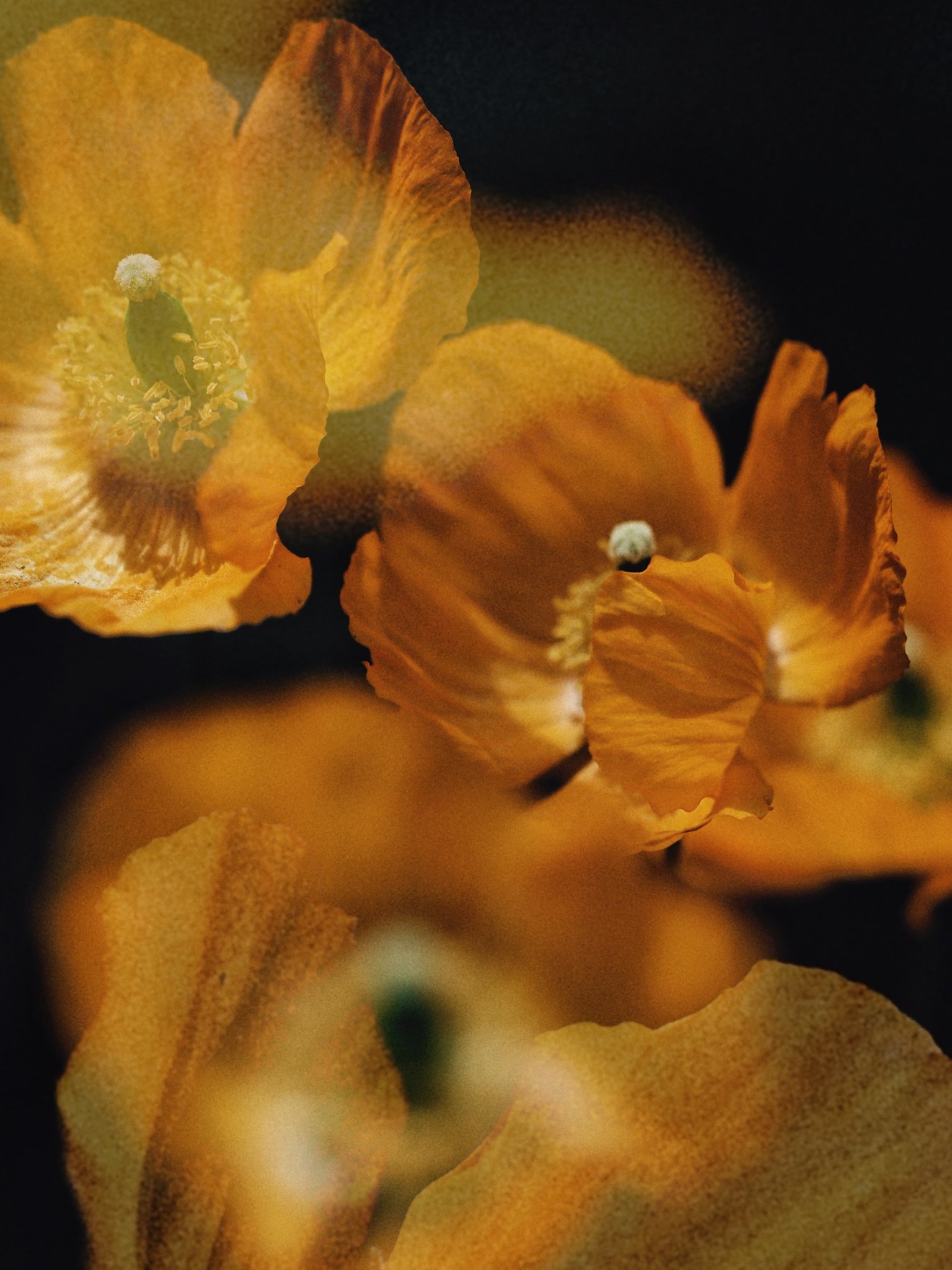
Every time I come across photography works portraying a floral theme, I keep my breath expecting to see something that will surprise me. In the vast majority, this is not happening. This time though it does. It is not to say that I am looking at something I see for the first time. What I do say is that what I am looking at feels honest, straightforwardly creative, promising. Your approach is penetrative. You look in between the subject, not just too close to it. Your creative technique supports that vision of yours. Shallow focus and parallax underline an intent to expand vision on the subject, to see more than the eye usually sees. Colors are vibrating. Forms come and go while remaining still. Movement and gesture interplay with each other in a delicate dance, sometimes violent, sometimes gentle, but always airy.
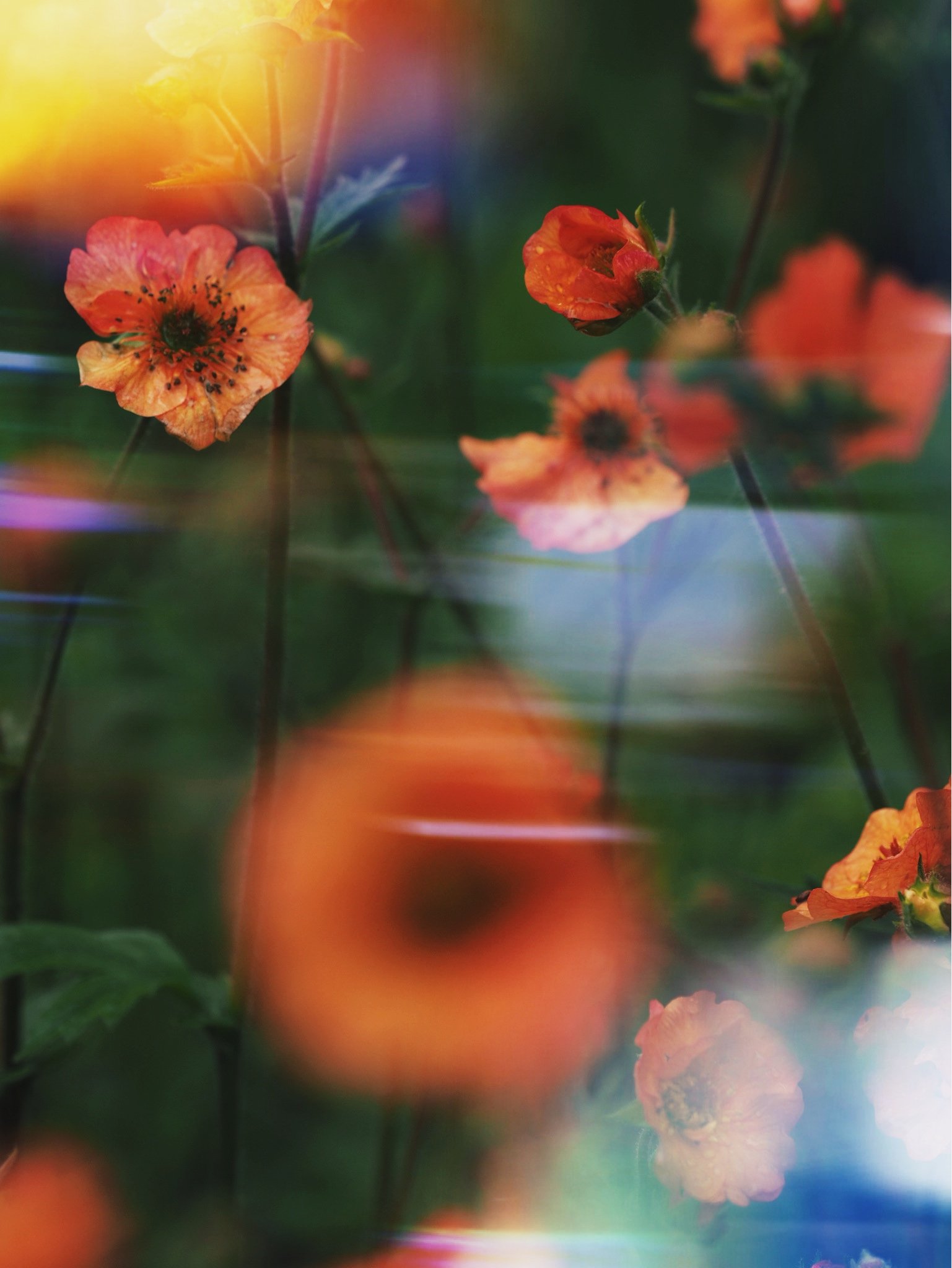
The deployment of your thoughts and emotions with the vivid and simultaneously sensitive portrayal of flowers provides a space for viewers to pause and reflect on the most familiar forms in nature. The technique and style of submitted images are tight, and it shows that you have exercised restraint that leads to good editing, therefore narrative, without becoming overly melodramatic or overwhelmingly artsy. I find that the three middle images take the subject to a new level with more confidence. Pictures 1 and 5 may seem a little bit afraid to take off. It is not to say that are ordinary pictures. But the freedom of expression I see in pictures 2, 3, and 4, is more convincing.
I find it difficult to pick one to be my favorite. I like them all the same. But if I had to only keep one, it would be picture 4. The reason is not purely aesthetically. In other words, I do not find this shot the most beautiful. The reason I ended up in this shot is the essential presence of green color. Green is a color that relaxes the mind. It is heavily linked to virgin Nature. Experiences in nature impact the viewer's mental state by reducing negative activity in their brain. These experiences create a positive state of mind, allowing them to escape toxic patterns and ideas. Studies have shown that we might feel a similar experience even when we see an image of nature. Therefore, apart from its aesthetic quality, picture 4 may have a stronger impact on the audience, causing positive effects.
This Series
IPA 2023 Honorable Mention, Nature: Flowers
Chromatic Awards 2023 Honorable Mention, Fine Art